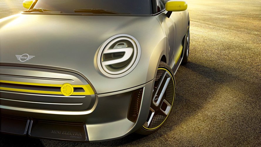
It replaces the three-dimensional white-on-black logo that first appeared in 2000.
Gone are the three-dimensional style, shading, gray tones and gray-on-black name of the previous version in favor of a stark contrast of black lines and the all-caps Mini name against a white background. It keeps the wings, which first featured on the iconic cars in the early 1960s, according to the Logos History blog, which has a comprehensive collection of logos stretching back to the brand's origins in 1959 under the British Motor Corp. and the Austin and Morris brand names. It also bears a visual similarity to the logo introduced during the mid-'90s. We're not saying the new logo was designed on an old PC using MS Paint, but it looks like it could've been.
Parent BMW Group says the new logo combines stylistic elements from the early phases of the classic Mini "with a future-oriented appearance that focuses on the essentials" and a two-dimensional look "allowing universal application." (Meaning, cheaper to produce?) It'll appear on all new Mini models starting in March on the bonnet, the rear, at the center of the steering wheel and on the remote control.

